
Choosing the Right Palette for Your Space

Choosing the right color palette for your interior spaces is one of the most impactful decisions you can make during a home repair, update, or full-scale remodel. Whether you are refreshing a single room in an Ogden Valley mountain retreat, repairing drywall after a winter plumbing leak in Davis County, or completing an extensive kitchen update in North Salt Lake, the colors you select dictate the mood, perceived size, and overall harmony of your home. However, selecting a paint color is rarely as simple as pointing to a tiny square on a paper swatch at the local hardware store. Color is a dynamic, shifting element that reacts intimately to natural light, artificial illumination, architectural scale, and the existing fixed finishes in your home.
Too often, homeowners make the mistake of choosing a paint color in a brightly lit showroom or from a digital screen, only to find that the hue looks completely different once applied to their own walls. Light changes throughout the day, shadows alter tones, and adjacent flooring or trim can completely shift how your eyes perceive a color. To achieve professional, lasting results, you need a methodical approach to color selection. This guide explores the critical factors that influence interior color palettes across Northern Utah homes, examining how lighting affects color, how to evaluate warm versus cool undertones, how to test samples effectively, and how to handle color selection following repairs or water damage remediation.
How Natural and Artificial Lighting Affects Interior Color
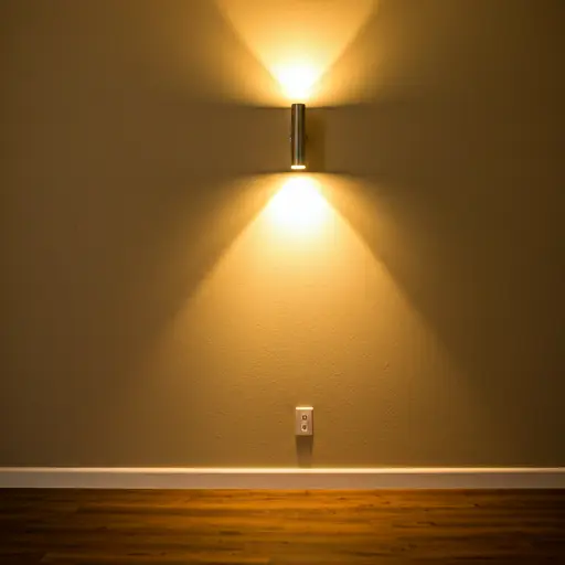
Lighting can dramatically change how a paint color reads from room to room and throughout the day. Window direction, shadows, and bulb color temperature all affect the final look.
The orientation of your windows plays an important role in how natural light enters your space:
- North-Facing Rooms: Natural light coming from the north tends to be cool, bluish, and consistent throughout the day. In spaces with northern exposure—common in many shaded canyon homes or tightly spaced urban lots—warm colors are essential to keep the room from feeling stark or clinical. Creamy whites, soft terracottas, and rich, warm grays help balance the chill of northern light.
- South-Facing Rooms: South-facing rooms receive bright, warm, direct sunlight for the majority of the day. This abundant light can wash out pale colors, making them look bleached or overly bright. You can embrace cooler tones here, such as crisp grays, soft blues, and muted greens, which absorb some of the intense light without making the space feel cold.
- East-Facing Rooms: East-facing rooms enjoy warm, yellow light in the morning, which shifts to cooler, bluer light by the afternoon. Warm whites and gentle yellows look stunning here early in the day, but you should test how the paint reacts when the light flattens out later on.
- West-Facing Rooms: West-facing spaces experience minimal morning light but bask in warm, dramatic, golden-hour light late in the afternoon and evening. Deep colors, saturated blues, and moody greens thrive in west-facing rooms because the evening sun brings out their richest undertones.
Artificial lighting matters too. Warm bulbs can make paint look more yellow or cozy, while cooler bulbs can make the same color appear crisper or bluer. Test samples under the lighting you actually use in the room.
Decoding Undertones: Warm vs. Cool Palettes
Every paint color possesses an underlying bias toward warmth or coolness. Even a neutral white or gray is hiding a secret tint of yellow, red, green, blue, or violet. Understanding these undertones is the secret to avoiding clashing color schemes.
Warm undertones lean red, orange, or yellow, while cool undertones lean blue, green, or violet. The important part is making sure wall color, flooring, trim, and fixed finishes do not fight each other.
When coordinating walls, trim, and flooring, consistency is key. If your baseboards and door casings feature a bright, cool-toned white trim paint, pairing them with an ivory wall color that has heavy yellow undertones can make the trim look dirty or aged by comparison. Matching undertone families ensures that your entire home flows harmoniously from room to room.
Why Paint Samples Are Your Best Friend
Relying solely on paper color swatches is one of the most common pitfalls in interior painting. Paper chips are printed with commercial inks, not actual paint, and their tiny size makes it impossible to judge how a color will behave across a 15-foot wall. Furthermore, placing a new color sample directly on top of an existing, brightly colored wall will trick your eyes into misjudging the new shade.
Use large peel-and-stick samples or painted sample boards and move them around the room before committing:
- Place them flat against the wall receiving direct window light.
- Slide them into dark corners and shadowed hallways.
- Hold them right next to your baseboards, door frames, and flooring.
- Observe how the color looks in the morning, under afternoon daylight, and at night with your lamps turned on.
Live with the samples for a day or two before committing to the final color.
Navigating Sheen Choices at a Homeowner Level
Color is only half the equation; paint sheen determines how light reflects off the surface and dictates durability. Choosing the wrong sheen can ruin an otherwise perfect color choice.
As a general rule, higher sheens reflect more light and clean more easily, but they also accentuate every single bump, dent, or tape seam on a wall. Lower sheens absorb light, creating a velvety, rich appearance that masks minor wall imperfections.
Preparing Repaired Drywall and Handling Water Damage Repaints
When you are updating a color palette as part of a home repair project—such as patching a hole in the drywall or repairing damage from a plumbing leak—surface preparation is just as critical as color selection. Paint will not magically hide texture discrepancies or damp substrates.
If you have experienced water damage, repainting should only occur after the moisture source has been fully repaired, structural framing is completely dry, and damaged drywall has been replaced or treated. Applying paint over damp materials traps moisture, leading to blistering, peeling, and mold growth. Once the area is thoroughly dried and patched, apply a quality stain-blocking primer over any water stains before rolling your final color coat.
For standard drywall repairs, feathered patching compounds must be sanded smooth and primed with a PVA drywall primer. Without primer, new drywall compound will absorb paint at a different rate than the surrounding painted wall, resulting in a dull, patchy spot known as “flashing.” Proper priming ensures uniform sheen and color fidelity.
Common Color-Selection Mistakes to Avoid
Homeowners often fall into familiar traps when planning their interior palettes. Avoiding these errors will save you time, money, and frustration:
- Choosing Paint First: Always select your textiles, rugs, upholstery, and hard finishes (tile, countertops, flooring) before picking your wall color. There are thousands of paint colors available, but far fewer fabric and flooring options. It is much easier to tint paint to match a sofa than to find a sofa that matches a hyper-specific wall color.
- Ignoring Flow Between Rooms: While every room can have its own personality, a home should feel cohesive. Standing in your entryway should not feel like stepping through a portal into an entirely unrelated universe. Maintain a common thread—such as consistent trim colors or a harmonizing undertone family—throughout your main living spaces.
- Failing to Account for Scale: Dark, saturated colors absorb light and make walls feel closer, which can cozy up a large, cavernous room but make a small bedroom feel claustrophobic. Light, reflective colors expand visual boundaries.
Frequently Asked Questions
How many colors should I use in an open-concept home?
In open-concept layouts, sticking to a cohesive main wall color (such as a versatile neutral) creates unity. You can introduce secondary accent colors through kitchen islands, built-in shelving, feature walls, or decor elements like rugs and throw pillows without visually chopping up the space.
Do ceilings and wall colors have to match?
No. A simple white ceiling is common, but the best choice depends on the room, lighting, trim, and overall palette.
Ready to Transform Your Space?
From flawless drywall repair and water damage restoration to professional painting and home updates, Hubbell Handyman & Hauling is here to help your home look its absolute best.